在接下来的一段时间学习看云上购买的一本Web开发实战书籍,来提升自己的软实力。
本部分为css实战部分。
表单input
主要添加了过渡下border和验证提示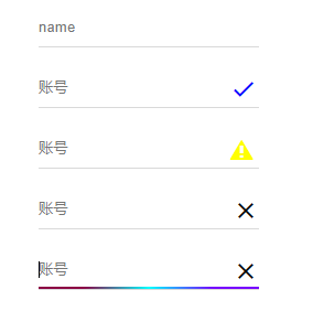
创建模版
1234567891011
<div class="input-field"> <input id="last-name" type="text" placeholder="name"></input> <span></span></div><!--带验证的--><div class="input-field error input-field-icon"> <input id="last_name" type="text" placeholder="账号"> <span class="gradient"></span> <i class="ion-android-close"> </i></div>
解释:
.input-field成为容器层,input和span并列排列。
让span来充当input的下border,然后在通过为类选择器:focus和兄弟选择器和伪类元素span:after来完成
设置样式
1234567891011121314151617181920212223242526272829303132333435363738394041424344454647484950515253545556575859 *{	box-sizing:border-box;}.input-field {	position: relative;	width: 200px;	margin: 20px 50px;}.input-field input {	background-color: transparent;	border: none;	border-radius: 0;	height: 35px;	width: 100%;	padding: 0;	box-shadow: none;	outline: none;	transition: all 0.3s;}.input-field input+span {	position: absolute;	top: 100%;	left: 0;	display: inline-block;	max-width: 100%;	z-index: 0;	width: 100%;	height: 1px;	border-bottom: 1px solid #d9d9d9;}.input-field span:after {	content: "";	position: absolute;	bottom: 0;	left: 0;	width: 100%;	height: 2px;	background: #2196f3;	transform: scale(0);	transition: all .2s ease-out;}.input-field input:focus+span:after {	transform: scale(1);}.input-field.input-field-icon i{	position:absolute;	right:0;	top:50%;	padding:0 5px;	font-size:1.5em;	-webkit-transform: translate(0, -50%);	transform: translate(0, -50%);}.input-field.input-field-icon input{	padding-right:30px;}

这里有个小技巧:要是验证图标垂直居中,达到居中效果。
top: 50%; 相对于父元素的高度
transform: translate(0, -50%); 相对于自身元素的高度。
自定义选择文本样式
使用::selection伪类选择器,我们可以实现与众不同的选择文本样式。
注意:只能设置背景色和文字颜色,同时不支持渐变色。
1234567891011121314
::selection { background: #009a61; color: #fff;}::-moz-selection { background: #009a61; color: #fff;}::-webkit-selection { background: #009a61; color: #fff;}
动态的边框
创建模版
12345
<div class="dynamic-border dynamic-border-2"> <span> </span> <img src="images/girl.jpg" alt=""></div>
整体思路:
创建一个容器,容器自身两个伪类元素,span又包含两个伪类元素,可以动态生成容器的4个边框(相对+绝对定位)。
在加上过渡效果就OK了。第二个动态边框只要按不同时间延迟组合就好了。
设置样式
1234567891011121314151617181920212223242526272829303132333435363738394041424344454647484950515253545556575859606162636465666768697071727374
*{ box-sizing:border-box;}.dynamic-border { position:relative; width:200px; height:200px; background:gray;}.dynamic-border:before,.dynamic-border:after,.dynamic-border span:first-child:before,.dynamic-border span:first-child:after { content:""; position:absolute; background:red; -webkit-transition:all .2s ease; transition:all .2s ease;}/*上边边框*/.dynamic-border:before { width:0; top:-2px; right:0; height:2px;}/*右边边框*/.dynamic-border:after { width:2px; height:0; right:-2px; bottom:0;}/*下边边框*/.dynamic-border span:first-child:before { width:0; height:2px; bottom:-2px; left:0;}/*左边边框*/.dynamic-border span:first-child:after { width:2px; height:0; top:0; left:-2px;}/*鼠标移动上去时*/.dynamic-border:hover:before,.dynamic-border:hover span:first-child:before { width:calc(100% + 2px);}.dynamic-border:hover:after,.dynamic-border:hover span:first-child:after { height:calc(100% + 2px);}/*添加过渡延迟时间*/.dynamic-border-1:hover:before,.dynamic-border-1:hover span:first-child:before { -webkit-transition-delay:.2s; transition-delay:.2s;}.dynamic-border-2:hover span:first-child:before { -webkit-transition-delay:.2s; transition-delay:.2s;}.dynamic-border-2:hover:after { -webkit-transition-delay:.4s; transition-delay:.4s;}.dynamic-border-2:hover:before { -webkit-transition-delay:.6s; transition-delay:.6s;}
上传组件美化
创建模版
1234567891011
<div class="file file-input"> <div class="file-inner"> 选择文件 <button class="btn btn-primary file-inner-btn"> 文件上传 <i class="ion-ios-cloud-upload-outline"> </i> </button> </div> <input type="file" /></div>
设置CSS样式
123456789101112131415161718192021222324252627
.file { position:relative;}.file input { position:absolute; top:0; left:0; opacity:0; width:100%; height:100%;}.file-inner { position:relative; width:250px; height:35px; border:1px solid #d9d9d9; border-radius:5px; padding-left:10px; line-height:35px;}.file-inner .file-inner-btn { position:absolute; right:0; top:0; height:100%; box-shadow:none;}
解释;
这里就用了一个技巧,把input设置为opacity: 0;然后在绝对定位并设置宽高100%,这样就会是整个区域都触发file的input默认事件。
参考文档