在接下来的一段时间学习看云上购买的一本Web开发实战书籍,来提升自己的软实力。
本部分为css实战部分。
水中倒影
要实现倒影,有两种方式:box-reflect方式和transform方式。
box-reflect效果
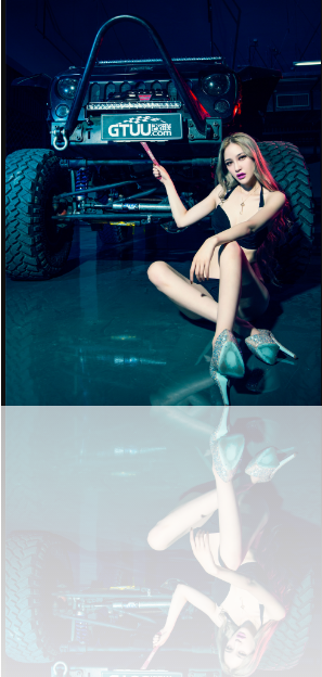
box-reflect方式(存在兼容性)
属性介绍
box-reflect: <direction> <offset>? <mask-box-image>?
参数说明:
- 表示倒影的方向,可能值:above、below、left、right(上下左右);
- 表示倒影与元素之间的间隔;
- 表示遮罩图像,可为url地址、渐变
创建模版
1<img src="./img/demo.png" alt="" />
设置样式
123
img { -webkit-box-reflect: below 0 -webkit-linear-gradient(top, rgba(250, 250, 250, 0), rgba(250, 250, 250, .1) 20%, rgba(250, 250, 250, .3)); }
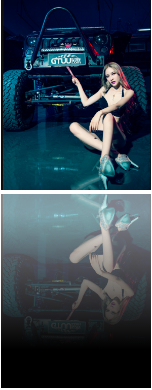
transform方式
这种方式其实就是复制图片,然后翻转,最后同样是使用渐变来充当遮罩层,覆盖在翻转的图片之上。
transform效果
创建模版
123
<div class="box-reflect"> <img src="img/demo.png" alt="" /> </div>
设置样式
使用伪类元素将我们需要将图片克隆一份,然后翻转过来,before存放背景图片,after达到渐变效果,这样after的z-index在before大,就达到了我们想要的效果。
123456789101112131415161718192021222324252627282930
.box-reflect { position: relative; width: 150px; float: left; margin-right: 40px; } .box-reflect img { width: 100%; height: 100%; } .box-reflect:before { background: url(img/demo.png) no-repeat; background-size: 100% 100%; transform: scaleY(-1); /*添加半透明是为了更真实*/ opacity: 0.5; filter: alpha(opacity='50'); } .box-reflect:before, .box-reflect:after { position: absolute; width: 100%; height: 100%; top: 100%; left: 0; content: ""; } .box-reflect:after { background-image: -webkit-linear-gradient(bottom,rgb(0,0,0) 20%,rgba(0,0,0,0) 90%); filter: progid:DXImageTransform.Microsoft.Gradient(gradientType=0,startColor=0, EndColorStr=#000000); }
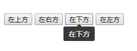
工具提示(tooltip)
css3设计的tooltip工具
创建模版
1234567891011121314
<div class="toop-group"> <button class="btn btn-primary tooltip" data-tooltip="在上方" data-direction="up"> 在上方 </button> <button class="btn btn-primary tooltip" data-tooltip="在右方" data-direction="right"> 在右方 </button> <button class="btn btn-primary tooltip" data-tooltip="在下方" data-direction="down"> 在下方 </button> <button class="btn btn-primary tooltip" data-tooltip="在左方" data-direction="left"> 在左方 </button> </div>
设置样式
总体思路:
- 利用伪类before生成提示工具的三角形border来形成。
- 利用伪类after生成提示内容(长方形)以及获取提示文本content(attr(data-tooltip)),来获取自身的自定义属性data-tooltip。
- 利用hover效果让其展现,在加入一些css3动画将表现的更好。
- 使用了calc用于动态计算长度值,使我们的组件更通用。123456789101112131415161718192021222324252627282930313233343536373839404142434445464748495051525354555657585960616263646566676869707172737475767778798081828384858687888990919293949596979899100101102103104105106107108109110111112113114115116117118119120121122123124125.tooltip{position: relative;}.tooltip:before{position: absolute;content: '';border: 5px solid transparent;}.tooltip:after{font-size: 14px;line-height: normal;position: absolute;padding: 5px 10px;content: attr(data-tooltip);white-space: nowrap;color: #fff;border-radius: 3px;background: #383838;}.tooltip:before,.tooltip:after{z-index: 1000000;visibility: hidden;-webkit-transition: .3s ease;-moz-transition: .3s ease;transition: .3s ease;-webkit-transition-delay: 0ms;-moz-transition-delay: 0ms;transition-delay: 0ms;pointer-events: none;opacity: 0;}.tooltip:hover:before,.tooltip:hover:after{visibility: visible;opacity: 1;}[data-direction='down']:before{top: -webkit-calc(100% - 5px);top: -moz-calc(100% - 5px);top: calc(100% - 5px);border-bottom-color: #383838;}[data-direction='down']:after{top: -webkit-calc(100% + 5px);top: -moz-calc(100% + 5px);top: calc(100% + 5px);}[data-direction='down']:before,[data-direction='down']:after,[data-direction='up']:before,[data-direction='up']:after{left: 50%;-webkit-transform: translate3d(-50%,0,0);-moz-transform: translate3d(-50%,0,0);transform: translate3d(-50%,0,0);}[data-direction='up']:before{bottom: -webkit-calc(100% - 5px);bottom: -moz-calc(100% - 5px);bottom: calc(100% - 5px);border-top-color: #383838;}[data-direction='up']:after{bottom: -webkit-calc(100% + 5px);bottom: -moz-calc(100% + 5px);bottom: calc(100% + 5px);}[data-direction='left']:before,[data-direction='left']:after,[data-direction='right']:before,[data-direction='right']:after{top: 50%;-webkit-transform: translate3d(0,-50%,0);-moz-transform: translate3d(0,-50%,0);transform: translate3d(0,-50%,0);}[data-direction='left']:before{left: -5px;border-left-color: #383838;}[data-direction='left']:after{right: -webkit-calc(100% + 5px);right: -moz-calc(100% + 5px);right: calc(100% + 5px);}[data-direction='right']:before{left: -webkit-calc(100% - 5px);left: -moz-calc(100% - 5px);left: calc(100% - 5px);border-right-color: #383838;}[data-direction='right']:after{left: -webkit-calc(100% + 5px);left: -moz-calc(100% + 5px);left: calc(100% + 5px);}.toop-group {padding-top: 100px;}
参考文档: