在接下来的一段时间学习看云上购买的一本Web开发实战书籍,来提升自己的软实力。
本部分为css实战部分。
单选复选Switch
switch组件是常用组件,默认的单选复选框都很丑,是这里使用CSS3美化switch。
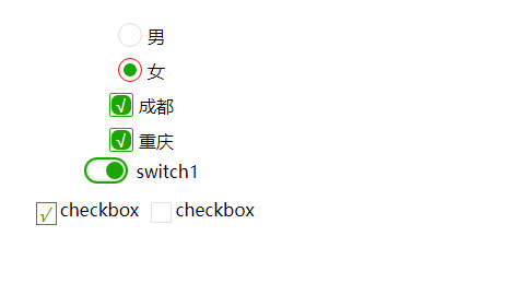
本问重点将一下整体思路(以单选为例)
创建模版
1234567891011121314
<label class="fan-check-radio fan-check-flat-radio"> <input type="radio" name="sex" checked> <div class="fan-check-media"></div> <div class="fan-check-inner"> <div class="fan-check-title">男</div> </div> </label> <label class="fan-check-radio fan-check-flat-radio"> <input type="radio" name="sex"> <div class="fan-check-media"></div> <div class="fan-check-inner"> <div class="fan-check-title">女</div> </div> </label>
这里讲解一下DOM结构用义:
- label包含整个组件,并且是label绑定与input的关系。
- 主要前端效果通过节点及其伪类完成
通过input:checked 和 兄弟选择器 + 控制类fan-check-media元素的样式
设置样式
12345678910111213141516171819202122232425262728293031323334353637383940414243444546474849505152535455565758596061626364*{box-sizing: border-box;}.fan-check-radio{display: flex;padding: 5px 0;cursor: pointer;justify-content: center;align-items: center;}.fan-check-radio>input{display: none;}.fan-check-radio:hover .fan-check-media {border-color: red!important;}.fan-check-inner,.fan-check-media{position: relative;}.fan-check-radio .fan-check-media {line-height: 20px;width: 22px;height: 22px;margin-right: 5px;text-align: center;color: #fff;border: 1px solid #d9d9d9;border-radius: 11px;}.fan-check-checkbox .fan-check-media {line-height: 20px;width: 22px;height: 22px;margin-right: 5px;text-align: center;color: #fff;border: 1px solid #d9d9d9;border-radius: 2px;}.fan-check-radio>input:checked + .fan-check-media {border: 1px solid #1aa500;}.fan-check-radio>input:checked + .fan-check-media:after {content: '';position: absolute;animation: radiozoom .1s linear forwards;border-radius: 6px;background: #1aa500;}@keyframes radiozoom {from {top: 8px;left:8px;width: 2px;height: 2px;}to {top: 4px;left:4px;width: 12px;height: 12px;}}解释:
节点及其伪类上下功夫了。
我们需要隐藏radio默认的样式,来做我们自己的UI:.fan-check-radio>input{ display: none; }
然后在就只这个
.fan-check-media这个节点需要使用相对定位,其伪类上使用绝对定位。
先设定input未选中时的样式,也是通过.fan-check-media及其伪类来控制。
在设置input选中时的样式,通过属性选择其[type=’radio’]:checked来控制radio被选中的样式。
具体操作请参考,下面的代码库
loading
先来看下效果

讲解一下大体思路:
- 构建外层包裹div(相对定位),内部8个span分别占据一周(使它们绕中心一周)通过绝对定位。
- 创建一个动画,并为每个span添加动画及动画延迟。(需要满足动画周期 === 8* animation-delay )
创建模版
我们创意个正方形的div,里面放置8个子元素。
12345678910
<div class="loader circle-line small"> <span></span> <span></span> <span></span> <span></span> <span></span> <span></span> <span></span> <span></span></div>
设置样式
通过定位和css的转换来移动每一个span的位置。
设置容器的基本样式和span的基本样式
1234567891011121314151617
.loader { position: relative; width: 5rem; height: 5rem;}.loader.circle-line span { position: absolute; display: inline-block; width: 1.5rem; height: .5rem; border-top-left-radius: .25rem; border-bottom-left-radius: .25rem; background: #1aa500; opacity: .05; -webkit-animation: circle-line 1s ease infinite; animation: circle-line 1s ease infinite;}
通过css3-transform得到loading图案
当然这哥定位还是很复杂,我直接参考[web开始实战](https://www.kancloud.cn/dennis/javascriptmethod/261478)的源代码
12345678910111213141516171819202122232425262728293031323334353637383940414243444546474849505152535455565758596061626364
.loader.circle-line span:nth-child(1) { top: 50%; left: 0; margin-top: -.25rem; animation-delay: .13s;}.loader.circle-line span:nth-child(2) { top: 1rem; left: .5rem; -webkit-transform: rotate(45deg); transform: rotate(45deg); animation-delay: .26s;}.loader.circle-line span:nth-child(3) { left: 50%; top: .5rem; margin-left: -.75rem; -webkit-transform: rotate(90deg); transform: rotate(90deg); animation-delay: .39s;}.loader.circle-line span:nth-child(4) { right: .5rem; top: 1rem; -webkit-transform: rotate(145deg); transform: rotate(145deg); animation-delay: .52s;}.loader.circle-line span:nth-child(5) { left: 3.5rem; top: 50%; margin-top: -.25rem; -webkit-transform: rotate(180deg); transform: rotate(180deg); animation-delay: .65s;}.loader.circle-line span:nth-child(6) { bottom: 1rem; right: .5rem; -webkit-transform: rotate(-145deg); transform: rotate(-145deg); animation-delay: .78s;}.loader.circle-line span:nth-child(7) { left: 50%; bottom: .5rem; margin-left: -15px; -webkit-transform: rotate(-90deg); transform: rotate(-90deg); animation-delay: 0.91s;}.loader.circle-line span:nth-child(8) { bottom: 1rem; left: .5rem; -webkit-transform: rotate(-45deg); transform: rotate(-45deg); animation-delay: 1.04s;}
注意:上面动画的周期必须要无限接近于最后一个span元素的动画延迟(动画延迟是平均分配的哦)。
动画,这是使用Opcity动画。
12345678
@keyframes circle-line { 0% { opacity: .05; } 100% { opacity: .7; }}
参考文档